
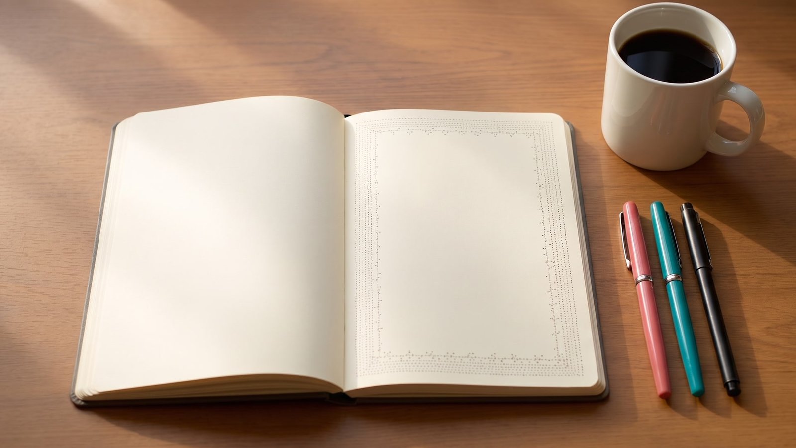
You open your journal, write the date, and then just stare at the page. It looks so plain. Everyone else’s pages online look like little works of art, and yours looks like a grocery list.
I’ve been there, and honestly, it’s kind of deflating. You want your journal to feel special, but you don’t want to spend an hour on one page.
Here’s what nobody tells you. Most of those pretty pages aren’t full of fancy art. They just have a nice border around the edge.
A border frames everything. Your messy handwriting, your to-do list, your random thoughts, all of it suddenly looks like it belongs on a page you’re proud of.
And the best part? A lot of borders are just lines, dots and simple shapes repeated. If you can draw a circle and a straight line, you can do most of this list.
I’ve grouped the ideas into four sets. Clean, simple line borders, nature and night-sky borders, no-skill borders using tape and paint, and fancier curvy ones for when you feel brave.
Start with one. Practice it on a scrap page first, then try it in your journal when it feels easy.
A Few Supplies That Make Borders Easier
You really don’t need much. A pencil, a good eraser and one black fineliner pen will cover more than half of these ideas.
A ruler helps a ton for the straight line borders. A clear plastic one is best, because you can see your page through it and line things up properly.
If you want color, a small set of colored pens or brush markers is plenty. Add a white gel pen for little highlights, and you’re set.
One tip before you start. Always sketch lightly in pencil first, then ink over it, and wait a full minute before erasing so the ink doesn’t smear.
Clean and Simple Line Borders
1. Dotted and Dashed Borders
If you’re brand new to borders, start right here. Dots and dashes are the easiest way to make a page look neat, and you basically can’t mess them up.
Draw a light pencil line around your page as a guide. Then go over it with tiny dots, short dashes, or a mix of both, keeping the spacing about even.
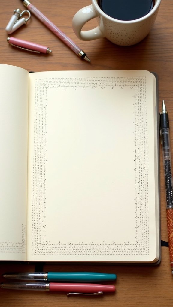
Once you get comfortable, try stacking a few rows. A solid line, then a row of dots inside it, then a dashed line, and suddenly it looks like a fancy frame.
You can also use these to split a page into sections. A dashed line between your to-do list and your notes keeps things tidy without looking heavy.
Try colored pens here too. A pink dotted line inside a gray dashed one looks soft and pretty, and it’s still super easy.
The thing is, don’t rush the dots. Big uneven blobs happen when you press too hard, so just tap the pen lightly and let it do the work.
2. Bold Black and White Stripes
Want something that really grabs attention? Thick black and white stripes look super graphic and modern, a bit like a fun zebra print around your page.
Use a ruler to mark lines along the edge, then fill every other gap with a thick black marker. Or go freehand and let the stripes wobble a little for a more playful, hand-drawn look.
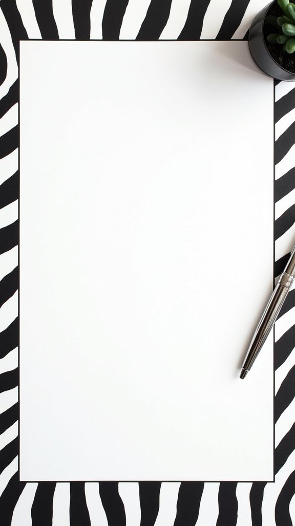
Mixing thick and thin stripes looks really nice too. A wide black band next to a skinny one gives it more movement than all the same size.
These work great on cover pages or for big monthly spreads. Your page instantly looks bold and confident.
Want a softer version? Swap black for navy, or do the stripes only along the top and bottom of the page instead of all four sides.
Fair warning, thick black marker often bleeds through thin paper. Test it on the last page of your journal first, and maybe skip it on the page right before something important.
3. Minimalist Box Outlines
Sometimes simple is best. A clean box outline makes your notes look organized, like a planner you’d actually want to use.
Grab your ruler and draw a neat rectangle around the page, leaving a little margin from the edge. Then add smaller boxes inside for sections like goals, notes or a habit tracker.
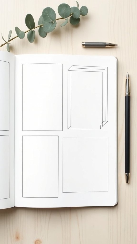
Want a tiny bit of extra style? Draw a box and then a second one just slightly offset, like a shadow. It looks 3D and takes about ten seconds.
Leave lots of white space around your boxes. Honestly, the empty space is what makes this style look calm and pretty instead of crowded.
Rounded corners are a nice twist, too. Draw your box, then soften each corner into a little curve, and it suddenly feels friendlier.
Use a pencil to mark your corners before drawing the lines. That way your boxes actually line up, and you won’t end up with one that tilts like it’s falling off the page.
4. Simple Geometric Borders
Geometric borders are just shapes in a row. Triangles, squares, little diamonds or zigzags, repeated along the edge of the page.
Start with a light pencil guideline and mark even spacing with your ruler, maybe every half inch. Then draw your shape at each mark so the pattern stays even all the way around.
Credit ‐ greynote
The video above is full of ideas for filling an empty notebook, so it’s a nice one to keep open while you practice. Pause it, borrow a shape you like, and try it on a scrap page.
Try mixing two shapes, like a triangle then a circle, then a triangle again. Or fill some shapes with color and leave others empty for contrast.
A strip of graph or dot grid paper makes this so much easier. You just follow the little squares or dots, and your spacing stays even without measuring.
Don’t worry if your triangles aren’t perfect. A tiny bit of wobble makes it look hand-drawn, which is kind of the whole charm of a journal anyway.
Nature and Night Sky Borders
5. Star and Moon Motif Borders
If you want your journal to feel a little magical, try stars and moons. They’re easy to draw, and they look so pretty scattered around a page.
Start by drawing a few crescent moons around the edges, spaced out. Then fill the gaps with stars in different sizes, some five-pointed, some just tiny crosses or dots.
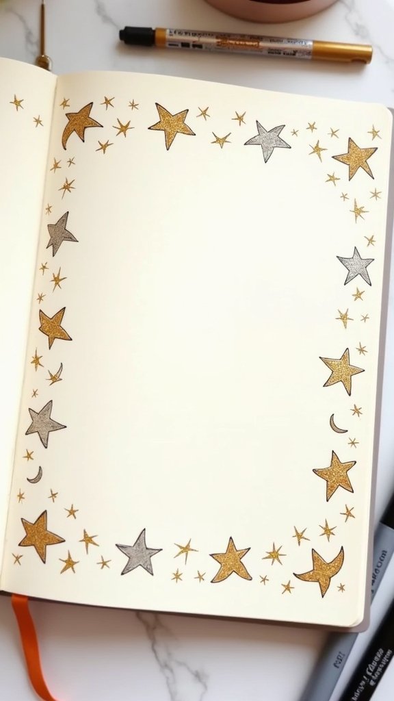
Color them gold, silver or a soft yellow. A gold gel pen or metallic marker makes them really shimmer when the light hits the page.
You could also draw the moon phases across the top, from new moon to full moon. It’s a sweet way to mark a month or track your mood.
On dark paper, a white gel pen makes the stars look like a real night sky. It’s honestly one of the prettiest borders on this whole list.
Mix up the sizes so it doesn’t look stiff. Stars all the same size in a straight line can look a bit like wallpaper.
6. Leafy Corners
Don’t want a full border? Just do the corners. Leafy corners make a page feel fresh and alive, and they take way less time than going all the way around.
Draw a curved stem coming out from one corner, almost like a vine growing in. Then add leaves along it, alternating sides, and go a bit bigger near the corner and smaller toward the tip.
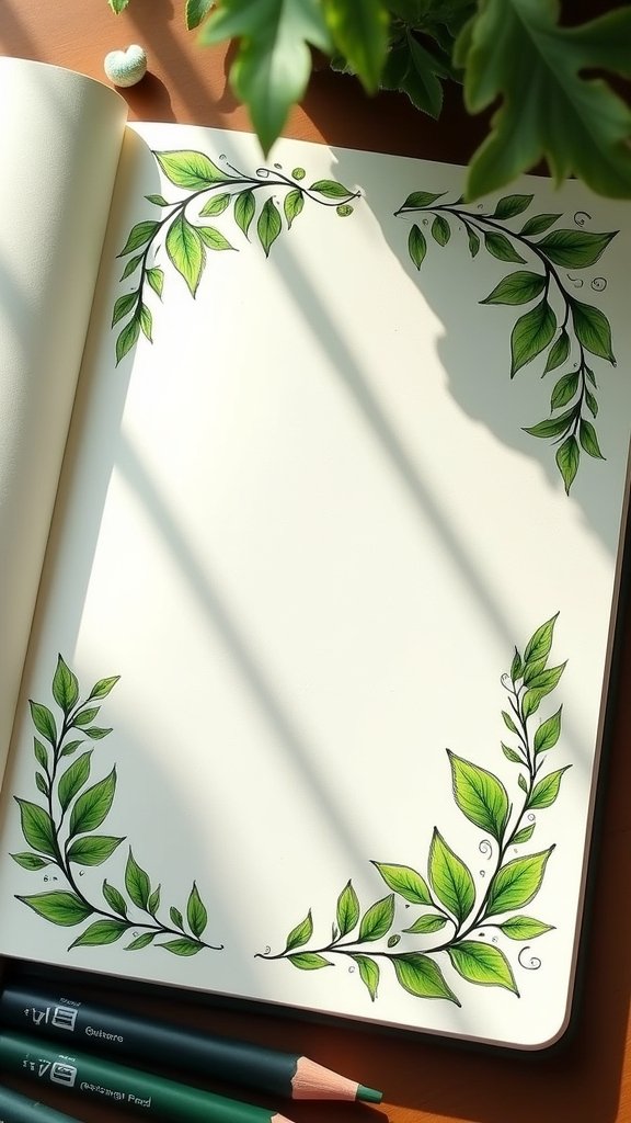
Mix up your leaf shapes. Some round, some long and pointy, some like little fern fronds, and the page will look much more natural.
Add a tiny berry or a small bud here and there. Just a few little red or orange dots along the vine make it look even more alive.
Color them with two or three shades of green if you can. A lighter green on one half of the leaf and a darker one on the other half looks really nice and takes no skill.
I’d suggest doing opposite corners, like top left and bottom right. All four corners can feel a little busy on a small page.
7. Floral Vine Frames
Floral vines are for when you want something a bit dreamy. Flowers and leaves winding around your title or the whole page make it look really special.
Draw a loose, curvy line around the page as your vine. Then add little flowers at a few points along it, plus leaves in between.
Credit ‐ Claudia Spaurel
The plan-with-me video above walks through a full bullet journal setup for a month. It’s really helpful for seeing how decorated pages fit around the stuff you actually write.
Keep the flowers simple at first. Five round petals around a dot looks great, and you can try tulips or roses later when you’re feeling confident.
Draw the vine in pencil first, add the flowers, and only then ink everything. It’s so much easier to move a flower than to erase a whole vine.
Leave a few gaps in the vine. If every inch is covered, your actual writing gets lost, and a journal page still needs room to breathe.
8. Seasonal Themed Borders
Changing your borders with the seasons keeps your journal feeling fresh all year. It’s kind of like decorating your home for the holidays, but with a pen.
Think about what each season looks like. Little flowers and bees for spring, suns and lemons for summer, falling leaves and pumpkins for autumn, snowflakes and pine branches for winter.
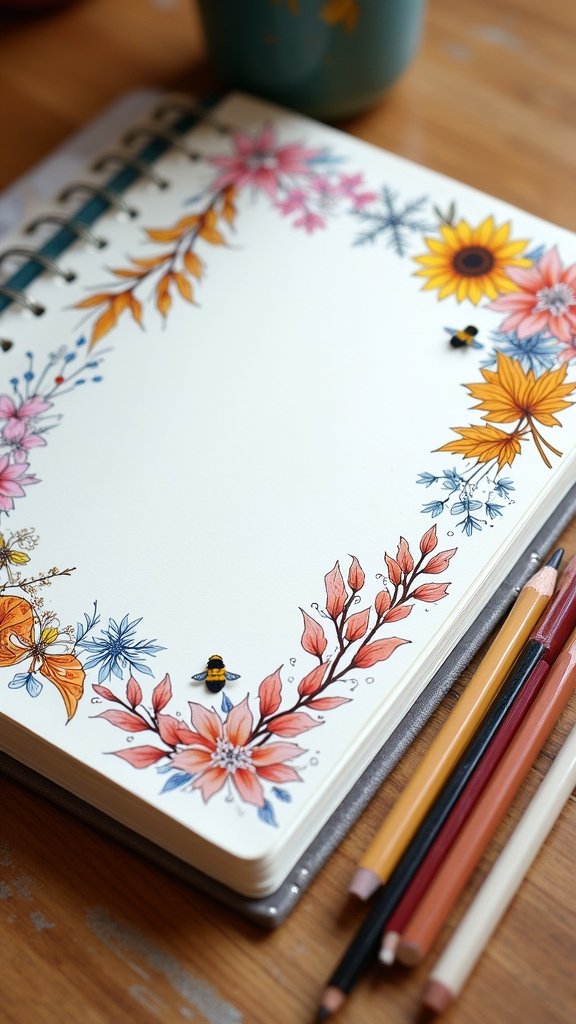
Draw them around the edges, mixing two or three small icons. A sunflower, a few leaves and a little bee already looks like a full spring border.
You can also use washi tape in seasonal colors if drawing feels like too much. Orange and brown for fall, pastels for spring.
Keep a little list of seasonal icons at the back of your journal. Then when a new month comes, you already know what to draw.
Just don’t try to cram every symbol into one page. Two or three ideas look nicer than ten, trust me.
Easy Borders That Need Zero Drawing Skills
9. Watercolor Wash Strips
Not a fan of drawing? Watercolor strips are your best friend. A soft splash of color along the edge looks dreamy and artsy, and nobody can tell if it’s “wrong.”
Wet a brush and lightly dampen the edge of the page. Then touch in a color and watch it spread, adding a second color next to it so they blend together.
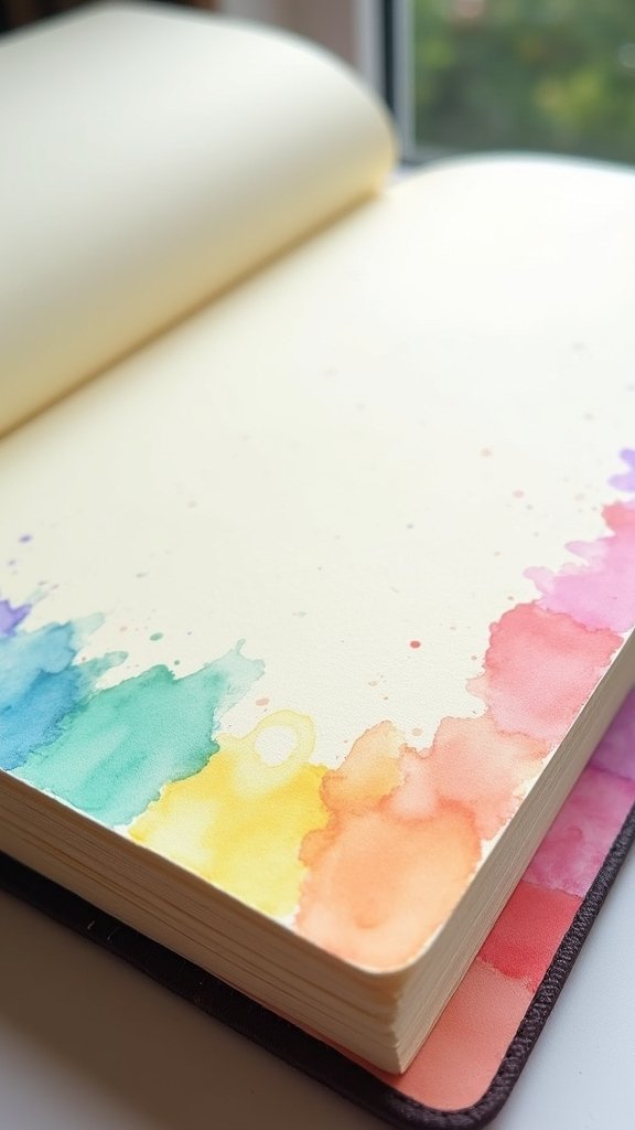
Go from pink to orange to yellow for a sunset feel. Or try blues and greens for something calm, like water.
No paints? Water-based markers work too. Scribble a bit of color on a plastic lid, pick it up with a wet brush, and paint it on.
Let it dry completely before writing near it. Watercolor can take a while, and it looks so sad when you smudge it with your hand.
Here’s the catch. Regular journal paper often wrinkles with water, so use very little, or try it in a journal with thicker paper that can handle paint.
10. Cute Doodle Icon Borders
Little doodles make a page feel friendly and fun. Tiny hearts, stars, flowers, clouds and suns lined up around the edges look so cute.
Pick three or four easy icons you like. Then just repeat them around the page in a pattern, like heart, star, flower, heart, star, flower.
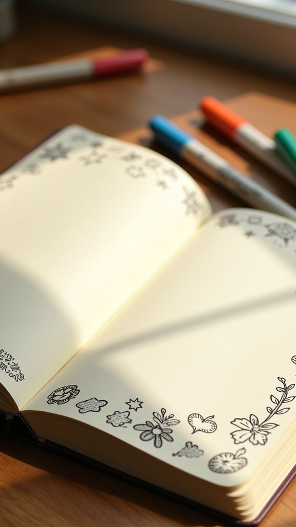
You don’t have to go all the way around. A row of doodles along the bottom, like in the photo, already makes the page feel finished.
Match the doodles to what’s on the page. Coffee cups for a cozy weekend, tiny books for a reading log, little suns for a summer list.
If you’re not sure how to draw an icon, look at the emoji on your phone. They’re simple shapes, and they’re great practice.
Keep them small and simple. Bigger, more detailed doodles take over the page, and you’ll end up spending more time on the border than your actual notes.
11. Patterned Washi Tape Lines
Washi tape is the ultimate shortcut. It’s a thin, pretty paper tape you just tear and stick, and boom, you’ve got a border.
Pick one or two patterns you love, like florals or soft stripes. Run a strip along the side of your page, or frame the whole page with four strips.
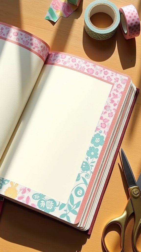
Layer two tapes together for a cool look. A wide floral tape with a skinny solid one along its edge looks like you planned it for ages.
Cut the ends with scissors instead of tearing them if you want a cleaner look. A little diagonal cut looks especially neat.
The best thing is that you can peel it off if you mess up. So you can try things without being scared of ruining the page.
Just a small heads up. Cheaper tapes can lose their stick over time, so press them down firmly with your nail after you stick them.
Curvy, Fancy Borders for When You Feel Brave
12. Classic Scalloped Edges
Scalloped edges are those soft little bumps, like the edge of a cookie cutter or a lace doily. They look sweet and a little bit vintage.
Lightly sketch a straight guide line in pencil. Then draw small half circles along it, one after another, keeping them about the same size.
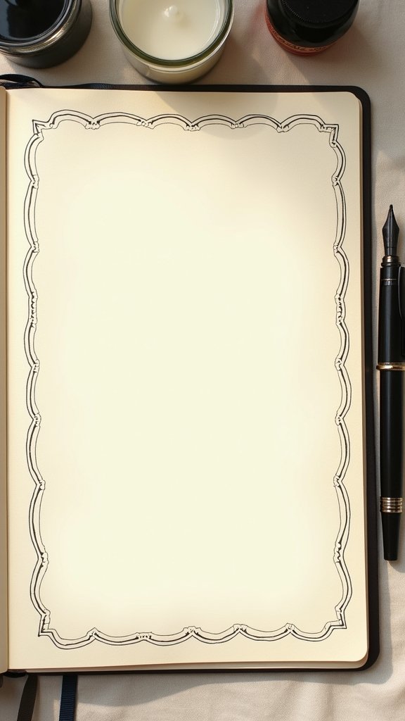
A coin or a bottle cap makes a great stencil if freehand bumps feel hard. Just trace half of it, move it along, and trace again.
Draw a second, bigger row of scallops outside the first for a double edge. Add a tiny dot inside each bump and it looks really polished.
Color the inside of each scallop in a soft pastel, maybe alternating two colors. It turns a simple edge into something really cheerful.
Go slow at the corners. That’s where scallops usually get squished or uneven, so plan where they’ll meet before you start inking.
13. Wavy Line Edges
Wavy lines make your page feel like it’s moving. They’re relaxed, easy and kind of soothing to draw, actually.
Draw one gentle wave along the edge with your pen. Then draw another wave right next to it, following the same curve, and keep going.
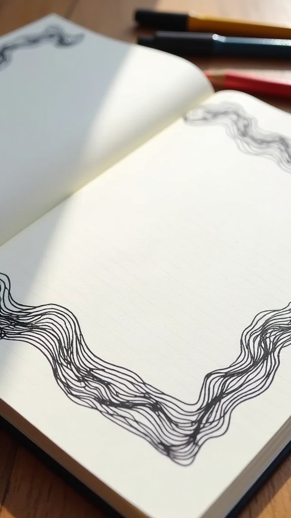
Stack lots of lines close together, like in the photo, and you get this cool, flowing, almost 3D look. Or keep it to just two or three waves for something lighter.
Try making some lines thicker by going over them twice. Or color the spaces between the waves in soft blues for an ocean feel.
Wavy lines are also a great way to warm up before journaling. Fill a scrap page with them for two minutes and your hand gets steadier.
You don’t need a ruler here at all. Wobbly is fine, and it honestly looks better when it’s a bit loose.
14. Hand-Drawn Lace Designs
Lace borders look really fancy, like something you’d see on an old wedding invitation. But it’s mostly loops and tiny details repeated over and over.
Start with a wavy guide line along the edge. Then add scallops along it, and inside each scallop draw small loops, dots or tiny flowers.
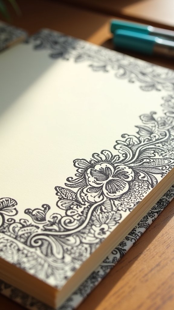
Fill some spaces with little dots, crosshatch lines or tiny circles. That’s where it starts to look like real lace instead of just bumps.
Look at a real lace doily or a lacy curtain if you have one. Copy just one small part of the pattern, and repeat it along your border.
A fine 0.1 or 0.3 pen really helps with all those little details. Thick pens make lace look heavy and blobby.
This one takes patience, so I’d suggest doing just one edge at first. A lace strip along the top of your page is already gorgeous.
15. Zentangle Inspired Patterns
Zentangle patterns are like doodling on autopilot. You divide the border into little sections and fill each one with a different repeated pattern, like swirls, checks or tiny circles.
Draw a few loose sections along the edge with pencil. Then fill each one slowly with your pattern, one tiny line at a time, without overthinking it.
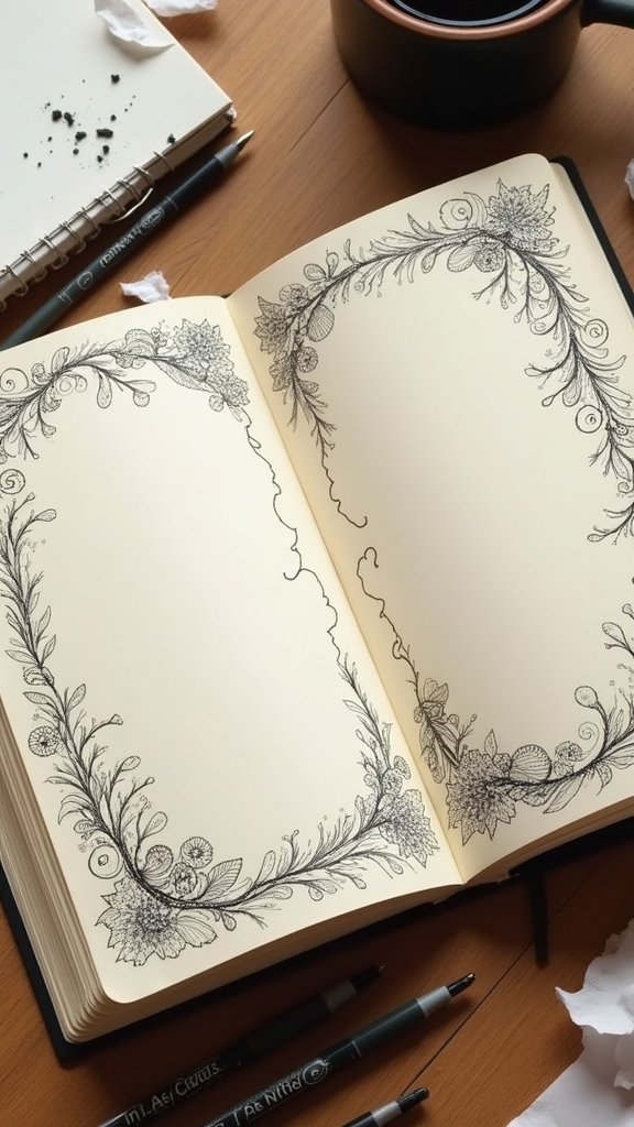
Black ink on white paper looks amazing here. Add a little pencil shading on one side of each shape and it suddenly looks deeper and more detailed.
So many people find this really relaxing, too. It’s a nice way to switch off after a long day while still making something pretty.
Need pattern ideas? Look around you. Brick walls, fish scales, basket weaves and even the tread on your shoes can all become a zentangle pattern.
Don’t aim for perfect. The patterns look best when you just let them flow, and small mistakes kind of disappear into all the detail.
Little Mistakes That Make Borders Look Messy
Most border problems come from the same few habits. The good news is they’re all easy to fix.
The first one is skipping the pencil guide. Freehand looks lovely when you’re relaxed, but if you’re nervous, a light pencil line keeps your border from drifting off at an angle.
The second is inking too soon and erasing too fast. Give your pen ink a full minute to dry, or you’ll smear a gray streak right across your pretty border.
The third is going too big. A border that takes up a third of the page leaves no room for your writing, so keep most borders thin and let the page breathe.
And the last one is comparing your page to someone’s perfect photo online. Those people have practiced for years, and yours is supposed to look like you made it.
That’s pretty much the list
Fifteen journal border ideas, and you really don’t need to master them all. Just pick one and practice it a few times.
If you’re new, start with dotted and dashed lines or washi tape. If you want something pretty and calm, go for leafy corners or a watercolor strip. And when you’re feeling brave, give lace or zentangle a try.
Your first border might look a little wobbly, and that’s totally okay. By the third page, you’ll be surprised how much better it gets.
So grab your pen and a scrap of paper. Which border are you going to try first?